How Android 14 is Google’s secret weapon to make Android tablets great

Google has developed a terrible reputation over the years for giving up on Android tablets. Google’s desire to save Android on tablets might best be compared as an on-and-off relationship. On the other side, Apple continued to broaden its iPad lineup, most recently with the iPad Pro (2022) and iPad 10th Gen, while putting significant effort into developing iPad OS.
Then Android 12L arrived, which was Google’s first indication that it was seriously considering foldable tablets and phones. The company focused even more on creating a unique experience for larger displays with Android 13 that can adjust the UI for various aspect ratios without causing apps to look like a magnified mess.
The Pixel and Nexus tablet lines are no longer available, so we can no longer see Google’s best work on Pixel smartphones to see the best of Android on large screens. (At least not until the arrival of the Pixel Tablet.) Samsung, on the other hand, decided to take matters into its own hands and developed One UI 5, which significantly elevates its Galaxy Tab range above the iPad in a number of important aspects.
With Android 14, Google has the ball back in their court and they are not holding back this time. In truth, Google has concentrated mostly on adapting Android 14 for large-screen handheld devices that come in a variety of forms and sizes with the introduction of Android 14’s first Developer Preview.
Android 14 handles the large screen disparity
With Android 14, the operating system will provide developers more flexibility in terms of features like window resizing, how sliding panes in an app behave, how one app can use an active link to launch another app window side-by-side, and how well they interact with peripherals, among other features.
The business has already developed development templates for how app user interface scaling functions on large screens, and it is able to adapt appropriately when the orientation changes between portrait and landscape usage. Consider the many UI element spacing templates that are offered to developers so they may have a sense of how to modify backdrop color shading and modify the positioning of useful UI elements in their apps (see the image above).
This is crucial and results in a more attractive Android user experience on larger screens. Now, the majority of Android apps simply appear stretched out on tablets and foldable devices, with each brand having a different approach and each developer going their own way.
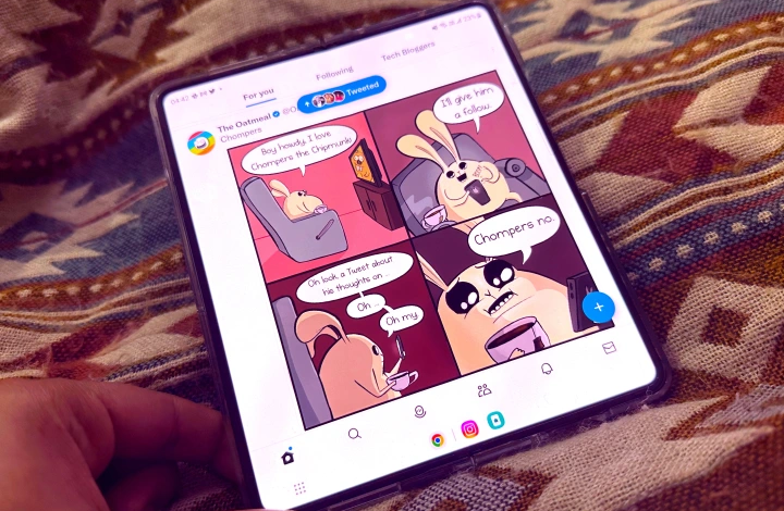
Consider Instagram, which launches on the internal display of the Galaxy Z Fold 4 in portrait mode like a phone. The rest of the screen can be blurred while the UI is either kept in the middle or moved closer to the left or right edge for one-handed use. While Twitter, on the other hand, completely fills the screen, it doesn’t play vertical videos very well.
Although it makes the most of the available screen space, there are some UI and visual trade-offs along the way. The fact that Google’s own first-party apps perform significantly better is not at all surprising. As more developers prepare their apps for Android 14, that difference will most likely be corrected in the upcoming months or at least within the following year.
A tier system of app goodness
Google has revised what it refers to as “app quality recommendations for large screens” at the same time that Android 14 system images are now accessible for flashing on compatible phones and via the Android Studio route on larger screens. Based on how effectively they scale for wide screens and the functionalities they provide, Google divides apps into three levels.
The bare minimum for applications is Tier 3. These programmed may not always provide the most aesthetically pleasant experience, but at least they will occupy the entire screen (or at least take up the full window in split-screen mode). However, they must provide the bare minimum support for peripheral devices like a keyboard, pen, mouse, and trackpad in addition to avoiding those unsightly sidebars (also known as letterboxing).
Tier 1 of applications that work on wide screens includes the best. In addition to meeting all the aforementioned requirements, these huge screen-loving apps include features like picture-in-picture mode and allow the seamless opening of another app in a split-screen separate window utilizing a deep link.
Significantly, a Tier 1 app must also permit users to open several instances of the same programmed in various windows. Apps like web browsers, document editors, file managers, and shopping apps are the best use-case examples.
Then, these programmed should likewise adjust themselves to the screen posture. The UI should adapt, for instance, when the device is used in tent mode, in a book-like format, or split across two screens. This adaptability is already available in Samsung’s foldable phones.
Boosting the computing chops
Google is also imagining software for foldable Android tablets and phones that can simulate a real computing experience. As a result, the company looks for apps that allow keyboard shortcuts similar to those found on Windows or macOS.
Google further suggests that developers go above and above by fusing click or tap gestures with significant keyboard modifiers like the Control and Shift keys. With the Magic Keyboard on iPads, Apple already partially does this, but Google’s effort sounds like a well-motivated effort that will ultimately significantly improve the computing experience for Android devotees.
Google wants all Tier 1 apps to display a scroll bar when using a trackpad or mouse, delving further into the UI intuitiveness area. Also, just like when using a PC to browse the web, UI elements should be able to display fly-out menus or tool suggestions with a cursor hover gesture.
Google wants all Tier 1 apps to display a scroll bar when using a trackpad or mouse, delving further into the UI intuitiveness area. Also, just like when using a PC to browse the web, UI elements should be able to display fly-out menus or tool suggestions with a cursor hover gesture.
If appropriate, Google is also giving “desktop-style menus and context menus” priority. Google wants Android apps to mimic the desktop gesture that enables a triple-click to select the complete line or paragraph of text when we’re talking about gestures.
Every Tier 1 app for Android 14 should support drag and drop for moving material while using a pen, both within the app and across various windows of the same or other apps. In order to encourage creative people, Google is also laying out the rules and requesting that developers build in support for pressure and tilt sensitivity for styluses, exactly like iPad OS does for an iPad and an Apple Pencil.
In fact, it would be ideal if apps allowed for different types of apps to have their own specific cursors, such as a crosshair in a shooting game, a brush in design apps, and magnifiers in reading apps. That Google has a suitable classifier for each type of app makes logical. For Tier 1 apps, huge screens are prepared; for Tier 2 apps, large screens are optimized; and for Tier 3 apps, large screens are differentiating.
Google isn’t messing around with Android 14
Google has made it obvious that the corporation is here to play the long game with tablets and foldable as Android 14 makes its way into developers’ hands. The Pixel Tablet will be a fantastic demonstration, but the emphasis on non-standard Android form factors also serves as a preview of the fantastic features that are supposed to be in store for the foldable Pixel.
When Android 14 enters the open beta stage, I’m eager to test it out, but I’m much more eager to see what fantastic personalization Samsung and Oppose add to the base of Android 14. It would be interesting to see how Apple responds to Google’s redoubled efforts to develop the finest mobile OS for huge screens.


